
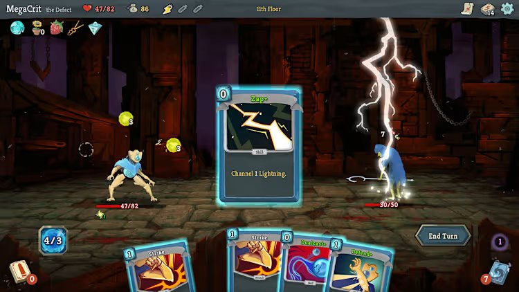
The UI is the part of a game the player notices only when it's broken, while it causes programmers problems constantly, because the UI is precisely the place where rendering, logic, input, localization, allocations, and designers' wishes all converge. In the previous part I went through why writing a good UI is hard, slow, and expensive.
Now I'll try to lay out the UI architecture along several axes — specifically axes, because one and the same UI can be diegetic by placement, immediate-mode by storage, reactive by data flow, flexbox by layout, and vector by rendering all at once, and the problems begin where people try to combine the incompatible.
Axis one: where the interface lives relative to the world
The most famous classification, beloved at game-design conferences, divides the UI by its relationship to diegesis, that is, to the fictional world of the game. It sounds like a term from film studies, because it is a term from film studies, which game designers dragged into projects and now throw around as a fancy word.
"Diege[s\z\sis]" has no single clear definition in games, and the term drags two rather different meanings behind it, each with its own set of names.
The classic meaning was originally διήγησις in Plato as narration in the proper sense, where the poet speaks in his own voice, "tells", as opposed to mimesis (μίμησις), when the author speaks in the voices of the characters. Here diegesis can be called simply "narration" / "telling" (telling/showing). Diegesis and mimesis are sometimes confused even by experienced game designers.
The modern meaning in film and games is already the meaning from which "diegetic sound" and "diegetic UI" grow. Here diegesis = the story world, the fictional universe inside which the events take place (the narrative world in books, the artistic setting in TV series, the storyworld in games, the diegetic world / diegetic space as a separate kind within tasks and individual game missions, or "the film's universe" in big cinema).
In cinema the term diégèse itself was introduced by Étienne Souriau in the fifties, and was systematized and entrenched in literature by Gérard Genette, when he separated diégèse (the story world) and the act of narration itself, as the narrator's action. Hence the confusion, when Russian texts feature the variants diegesis / diegeza / diegesis, and sometimes "diegeza" is used specifically for Genette's "world", and "diegesis" for Plato's "narration".
For our UI context the second meaning is exactly what matters, where a diegetic interface exists inside the world and inside the story and which the character could, in principle, "see". So I'll mostly talk about Genette's diegesis (the one inside the world and inside the story), and leave Plato's to the literary scholars, though it too is well represented in games.
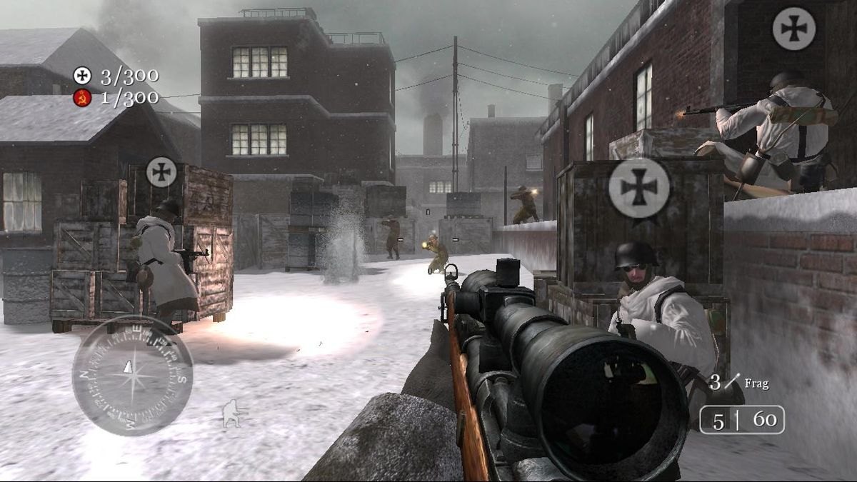
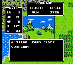
Diegetic UI lives inside the world and the character literally sees it. The clock and health bar right on the back of the spacesuit in Dead Space, the wrist Pip-Boy in Fallout, the cockpit dashboard in Elite Dangerous. The player and the character look at effectively the same object, and this is very cool for immersion but expensive for development, because now your health bar is not a sprite over the screen, but a three-dimensional object in the scene that has to be lit, reflected, occluded by geometry, and made readable from any camera angle.
The funniest thing here is that the first games were diegetic "by their nature", and an interface as a separate entity simply didn't exist. In Pong there's no "health bar", there are two paddles and a ball, and the score is two digits at the top that naturally belong to that world. The world really was very small, so there were no questions about what those digits were.
At the same time there was a whole class of games that got a diegetic interface for free and, as it were, "by inheritance", simply because their fictional world already contained a dashboard. Any flight simulator, racing arcade, or tank cockpit — here the developer doesn't even have to try, the speedometer and tachometer are the UI, and by construction it lives inside the world, because a car without a speedometer would look strange. Elite Dangerous is a direct descendant of exactly this line, the cockpit as a natural carrier of information, and the designer's merit here is more in not spoiling what the plot served up on a platter.
Consciously, the immersive sims of the nineties started dragging the UI into the game world, when System Shock (1994) and its descendants tried to make the player and the character look at the same screens, because the whole philosophy of the genre was built on "you are the one who's in there". It came out expensive, clumsy, and in places unreadable, but the direction was found.
Metroid Prime (2002) is often called a "textbook" of Diegetic UI, and one of the best and most coherent implementations of this kind of interface.
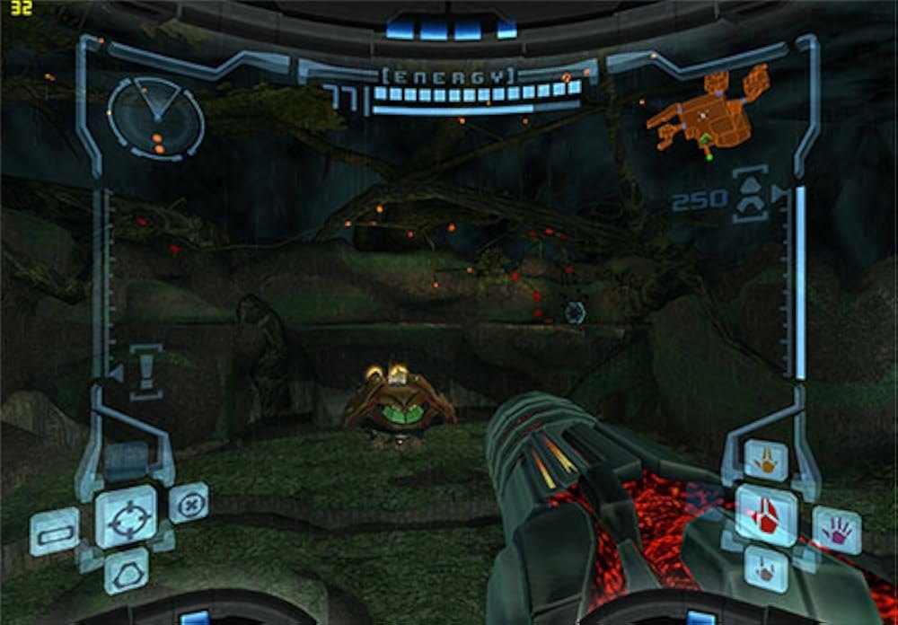
The whole interface is the helmet's visor through which the player looks at the world, the readouts hang at the edges of the view, and if something bright explodes nearby, the protagonist's face is reflected on the inner side of the visor. If you walk into steam or underwater, the glass fogs up and gets covered in droplets — here diegetic UI was made a feature of the game.
Then the idea ripened across different studios independently, and in one year several major projects rolled out the diegetic approach at once.
Dead Space (2008) put health right on the spine of Isaac's suit, ammo and stasis charge on the guns themselves, and made the inventory and map a hologram that the character projects in front of himself in real time. The game doesn't pause when you open a menu, and while you're rummaging in the inventory, a monster can come up behind you.
Far Cry 2 (2008) went even more radical and threw out the minimap entirely. Want to orient yourself — pull out a physical paper map and a GPS device, and the character literally holds them in his hand in the middle of a fight. Healing there is also diegetic, with an animation of Jack digging out a bullet or resetting a finger, and malaria pills that you have to actually take out.
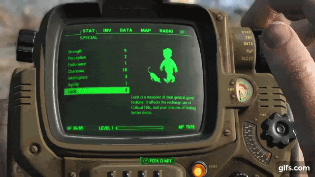
Fallout 3 (2008) gave the wrist Pip-Boy, where the entire inventory, map, and stats are the screen of a device on the wrist, which the character looks at together with the player.
The academic theory arrived after the practice of using it, and the most "famous classification", the one usually at conferences, took shape in Fagerholt and Lorentzon's thesis "Beyond the HUD" in 2009, and a Gamasutra article dragged it into wide circulation in 2010. That is, first the studios, feeling their way in 2008, rolled out ready, working examples of all four categories, and only afterward did the pretty words diegetic / non-diegetic / spatial / meta appear, with which all of it was retroactively sorted onto shelves. A classic of the genre — theory catches up with production and appropriates the terminology.
As soon as the world appeared and grew up, so did the question of "where to put all the service information" that the player has to be shown but that no longer fits into that world. Naturally the first answer was the HUD (heads-up display, or Presentational UI), sprites over the screen, drawn in a final pass after the whole scene. Lives, score, ammo, a timer. And this habit of drawing the UI "on top and separately" turned out to be so convenient that it became an industry standard people then spent decades trying to get rid of.
(HUD) Presentational UI is the classic interface that hangs over the picture and is in no way explained by the world. The character doesn't know about it, the laws of the world don't act on it. In implementation it's cheap, predictable, and the most widespread, whatever the fans of total immersion may say.
The word HUD itself, game designers, as usual, didn't invent out of nowhere but pinched from military pilots, where a heads-up display is the transparent glass in front of the pilot's eyes, onto which altitude, speed, and the sight are projected, so as not to lower one's head into the instruments during combat. Games took the term and kept only the meaning "important numbers hang in front of your eyes over everything else".
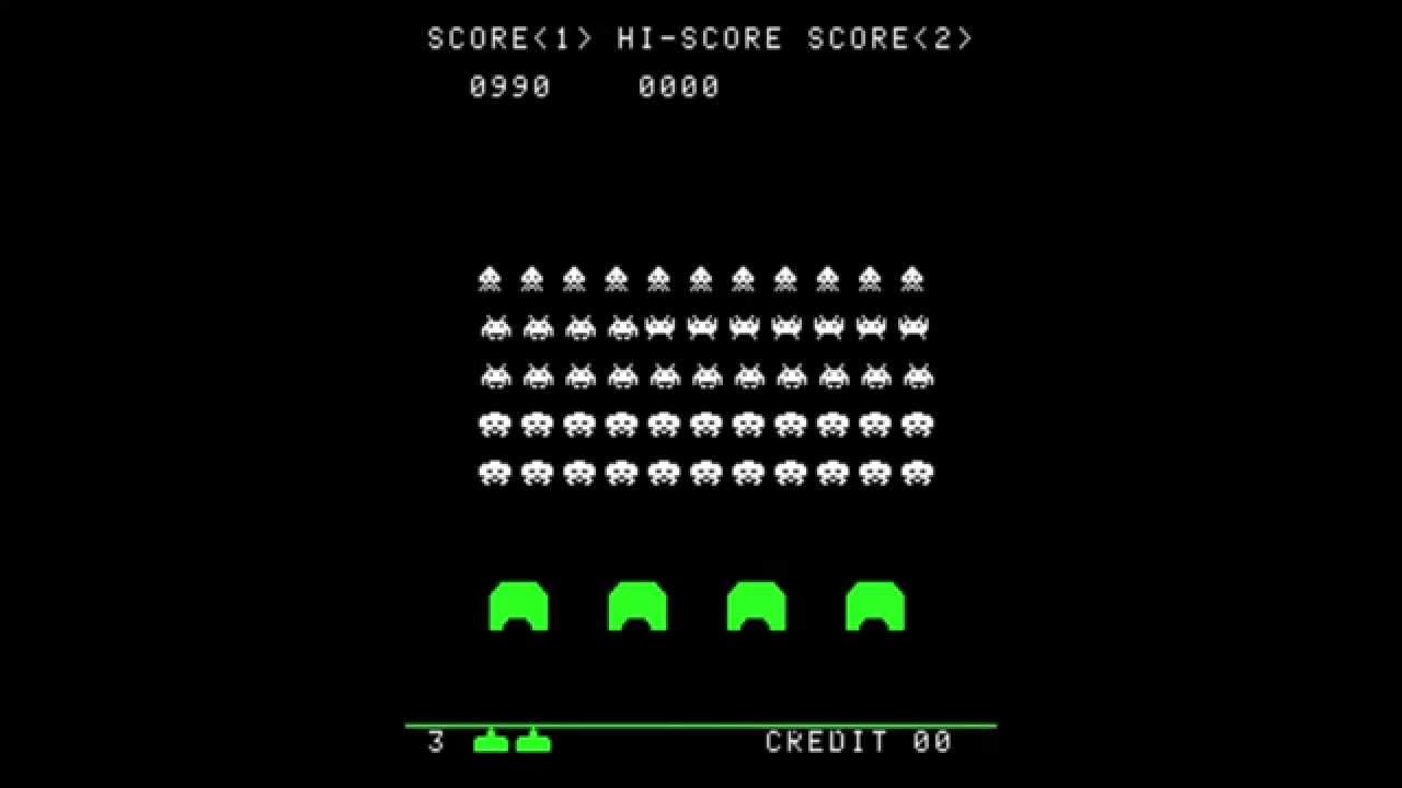
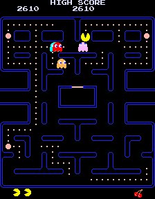
The canon took shape in the arcade hall, when Space Invaders (1978) hung the score and high score at the top, and the remaining lives and credits at the bottom. This "score on top, lives on the bottom" layout turned out so natural that it's still copied without thinking. The HUD here was not an informational but a monetization tool, because the score on screen is not a service number but a psychological hook, forcing you to drop one more coin to beat your own result, while the life counter is a timer until the moment the machine asks for money again.
Pac-Man (1980) added an important detail — it showed lives not as a number but as little Pac-Man icons, and the level as fruit in the corner. An icon instead of a digit reads faster, without distracting from the gameplay, and this is the first case where the HUD started to be designed for speed of perception, rather than just "as long as it fits".
Defender (1981) gave the industry the minimap, as a forced solution, because the player physically couldn't see enemies beyond the edge of the screen, and without that knowledge the game turned into a lottery. A radar at the top showed the whole level in compressed form, and so an element of the HUD appeared that exists solely because the world is bigger than the window through which you look at it. Forty years later the minimap would grow over with quest icons, points of interest, and markers to the state of a Christmas tree, but it was born right here, out of a lack of view.
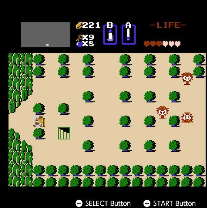
The Legend of Zelda (1986) assembled a good combination out of all this, which thousands of games would later use: hearts as health, a permanent panel at the top with a counter of rupees, keys, bombs, and active items. The hearts turned out to be a brilliant find for exactly the same reason as the Pac-Man icons — the amount and state of health can simply be seen, without reading a number, with the added novelty of a "half heart".
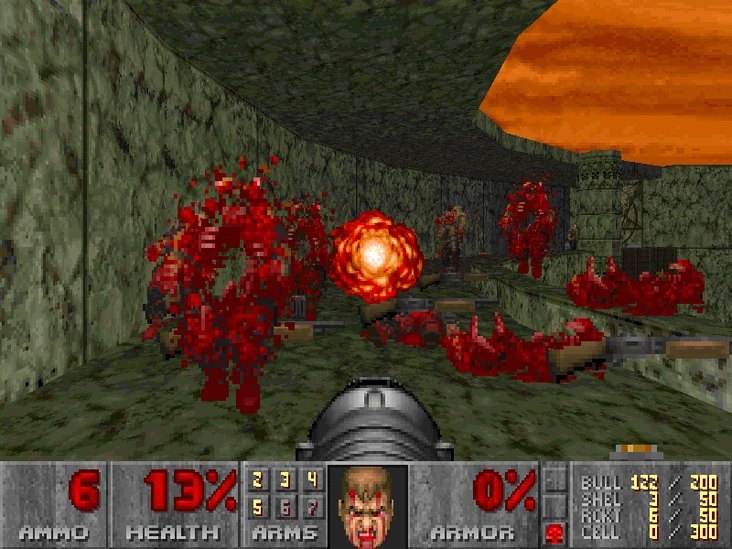
Doom (1993) showed that the HUD can carry not only information or icons, but full-fledged animations. In the bottom panel, next to the ammo and armor, lived Doomguy's face, which got covered in blood as health was lost, grinned when picking up a weapon, and glanced in the direction the damage came from. Technically it was a service indicator, but it was perceived as a game element that added immersion rather than taking it away.
Then Halo (2001) introduced regenerating shields with a bar that restores itself, and Call of Duty 2 (2005) went all the way and threw out the health bar entirely, replacing it with reddening of the screen edges and splashes of blood when you get hit, with everything healing on its own in cover. This is still pure presentational UI, no diegesis, the character doesn't know about the red edges, but the information is conveyed not by a number but by a sensation, and the screen stays empty.

Meta UI works as an element technically outside the world, but it hints at the character's state, for example drops of blood or redness at the edges of the screen at low health, fogging and heavy breathing when tired. There's no world on screen, but the player's brain builds the connection itself, and this is, perhaps, the cheapest way to create a sense of state close to Diegetic behavior — just a fullscreen effect with parameters.
At the border between presentational and meta, the whole tidy classification the academics came up with starts to crack at the seams, and those very red screen edges at low health, which I just filed under presentational as "a contextual HUD that learned to hide", in the Fagerholt and Lorentzon canon are actually listed as a model example of meta. This is a gray zone of the classification itself, because the difference between "service indication that just pretends to be unobtrusive" and "an effect that hints at the character's state" depends on interpretation and the left heel of your UI designer. Under the hood both of them will be a fullscreen pass with parameters, so keep in mind that meta is not a separate technology, but a separate vision — not "how much ammo is left", but "how does the hero feel right now".
The earliest form of meta is so old it wasn't even considered an interface. When a seventies-eighties arcade machine flooded the screen white or red for a fraction of a second at the moment of a hit, that was proto-meta, because it didn't concern the world on screen, the character didn't know about the flash, but the player's brain instantly built up the logic of the event into "I was hurt". Cheap to the point of indecency, one frame of an inverted palette, and it worked better than modern inventions.
Then the idea calmly ripened, from "the screen reacts to a state" to blood splashes on the camera when wounded, blur and double vision from a concussion, wobble and a blurring picture when the character is drunk or poisoned. The GTA series with its drunken camera is a classic of the genre — you read nothing and look at nothing, you simply physically feel that the hero is drunk, because the controls drifted along with the picture. And all of this, in implementation, remains nothing more than a couple of fullscreen effects, the cheapest way to fake a sense of state without building a single three-dimensional object.

The real milestone, after which meta UI started being taken seriously, is Eternal Darkness: Sanity's Requiem (2002). There was a sanity meter, and when it dropped, the game began to change around the character. The screen tilted, insects crawled along the walls, the hero's head fell off without warning (and then it turned out to be a hallucination). The developers didn't stop there, and the game muted the sound, threw up a fake blue screen, or showed a fake message "your save is corrupted and will now be deleted" and a fake "To Be Continued" in the middle of a cutscene.
Meta stopped hinting at the character's state and started getting into the player's head directly, breaking the fourth wall with the same cheap tool, the fullscreen fakeout, only aimed not inward into the world but outward, into the living room in front of the screen.
After this the horror genre effectively adopted meta UI as its main language, and for example Amnesia: The Dark Descent (2010) showed clouded reason through distortion of the picture, trembling vision, and encroaching blackness when the character sat in the dark too long.
Spec Ops: The Line (2012) made meta UI into a separate game mechanic, and as the protagonist's mind went off the rails, the loading screens turned from neutral tips into accusatory lines addressed personally to the player. The character's state leaked into the service elements that are supposedly outside the world altogether.

Furthest of all went Hellblade: Senua's Sacrifice (2017), where the heroine's psychosis is conveyed almost entirely through meta means, like sound with voices that whisper as if right behind you in the headphones, constant distortion and defocus of the picture, the blurring boundary between the real and the imagined. There's no "madness level" bar there, because the character's state is the interface, and the player experiences it by the same means as the heroine, while formally all of it remains screen-space effects over the render.

In modern games meta UI has become a standard trick in the post-processing toolkit and a separate specialization for game designers. Desaturation and the picture going gray on the edge of death, vignette and pulsing at the edges at low health, chromatic aberration from a concussion, a color shift and waves from poisoning — all of this is meta, made by one or a few people, and no big project ships without this set anymore. It's still the most cost-effective way, by "effect per unit of effort", to talk to the player beyond the game, handing out a very small portion of data while the player's brain fills in everything else for free.
Spatial UI is tied to the space of the world, but not to specific in-world screens. These are tags over NPCs' heads, quest markers, highlight outlines of interactive objects, and although these elements formally exist in three-dimensional scene coordinates, the character doesn't see them, only we do, because they're usually all built on top of the presentational layer.
The roots of spatial UI grow from strategy games, like the green ring under a selected unit and the health bar hanging right over its head. This is the purest spatial UI element, which lives at a point in the world, moves along with the object, but the unit itself knows nothing about its ring, only the player sees it from above.
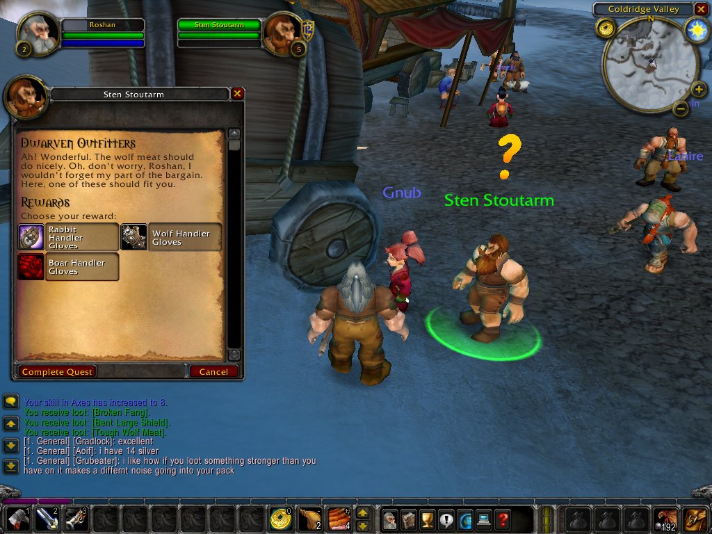
The solution was utilitarian: you have to somehow show what exactly you selected and how much health it has. When the genre moved into 3D and open worlds, spatial flourished, and its symbol became the yellow exclamation mark over the quest-giver's head, which World of Warcraft (2004) mass-canonized, and since then the "!" over an NPC and the "?" over the one to whom you turn in a task read intuitively in any game in the world without a single line of explanation.
It's a brilliant move in its simplicity, where you don't have to create dialogues, don't need hints, the player sees a point in space from afar and immediately understands its function.
In parallel they solved a more subtle task, navigation. Fable (2004) added a glowing golden trail right along the ground, leading to the next goal, literally drawing a path in the world rather than an arrow in the corner. The player walked along a trail that didn't exist, while not tearing their eyes away from what was happening.

A separate large branch of spatial mechanics is the highlighting of interesting objects right in the scene. An outline on an object you can interact with, a popup "press to pick up" by a specific thing, a glint on a loot box. And when a lot of highlighting was needed, whole vision modes were born: Detective Vision in Batman: Arkham Asylum (2009), the Witcher senses in The Witcher 3, Focus in Horizon, the hearing mode in The Last of Us.
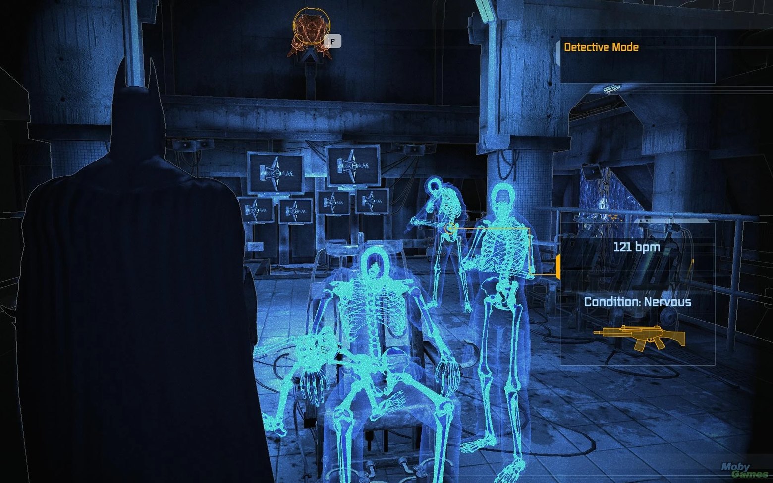
Technically this is a spatial overlay that outlines enemies, tracks, and objects through the geometry, and formally the character "peers in" at these moments, but we see the highlight anyway, and it works in world coordinates.
Mirror's Edge (2008) with its Runner Vision is the same trick turned toward navigation: the needed objects on the route light up red, directing the gaze along the level, while Faith sees no red at all.

Then open worlds, especially of the Ubisoft school, plastered the map and the world itself with a cloud of icons hanging at world points, and the player started looking not at the landscape but at the garland of markers over it.
Adjoining this is the recent argument about the yellow paint on the ledges you can grab. This is a borderline case, because the paint is baked right into the world's texture and is formally almost diegetic, but by function it's a pure spatial pointer "climb here", and some players consider it a crutch that the studios lovingly taped to your hand.
As usual, the pendulum swung back and games started offering to turn off the markers and navigate by descriptions (exploration mode in Assassin's Creed Odyssey), and the most elegant solution was shown by Ghost of Tsushima (2020), when instead of an arrow waypoint they made a guiding wind that blows toward the goal, driving leaves and grass.

Functionally it's all the same spatial direction pointer, but visually it returned back into diegesis, because the wind is part of the world, and the hero, as it were, feels it. The circle closed: spatial navigation was dressed in diegetic clothes to remove one more icon from the screen.
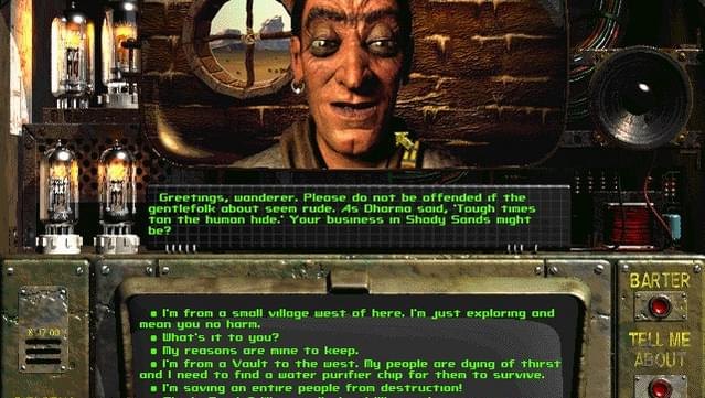
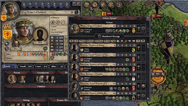
There's also Narrative UI — it's how the game talks to the player through subtitles, dialogue trees, quest journals, codexes, and notes. Formally it's almost always Presentational UI, because the character doesn't see the subtitles at the bottom of the screen and the law of the world doesn't act on them, but narrative UI more than others violates the purity of the classification and tends to drive into the world. The dialogue wheel in Mass Effect hangs over the picture and is not explained by the world, but the terminals and audio diaries in System Shock and BioShock are already half-diegetic screens that the character actually holds in their hands and listens to. The quest journal in The Witcher 3 is written from Dandelion's point of view as in-world text, although it opens with an ordinary paused menu, and this duality lets us single this type out as separate, rather than dissolving it into the HUD or menus. Narrative UI is that rare case when the most "textual" and seemingly simple interface element drags a whole data subsystem behind it. It also creeps a bit onto the second axis, which is why it's often set apart entirely.
Narrative UI stands apart and is classified not by where it's drawn, but by what it carries, and it carries story and data. And depending on the implementation it calmly drives into any of the four previous types, for example as an audio diary in the hands it's half-diegetic, and a note popping up over an object is closer to spatial. This, by the way, is the only category defined through content rather than through the rendering method, and that's exactly why it's eternally tending to drive into the world.
Narrative UI is the grandfather of all interfaces, and the first games consisted entirely of it alone. Colossal Cave Adventure (1976) and Zork (1977) were pure text, and you had to read a room's description and type commands in words, and the whole interface was just text in and out. No HUD, no world on screen, because there isn't really a screen either, there's a dialogue between the game and the player in natural language. So "the most textual and seemingly simple element" is actually the ancestor of all the rest of the UI, and graphics grew up around it later.
Then narrative UI developed in the direction of complicating what hides behind the text. First a dialogue box at the bottom of the screen appeared, the canon of JRPGs and adventures, from Dragon Quest (1986) to point-and-click adventures.
Then text began to branch, and classic CRPGs like Fallout (1997) gave a numbered list of lines, some of which opened only with the right skill, and here narrative UI for the first time dragged a whole subsystem behind it, when behind the harmless list of answers stood stat checks, state flags, and forks that have to be stored somewhere and saved somewhere.
Mass Effect (2007) invented the wheel, where the options are laid out in a circle by tone, the friendly ones at the top, the aggressive ones at the bottom, and the player chooses not an exact phrase but an intention, after which the fully voiced Shepard delivers an expanded line.

This is an attempt to pull narrative UI out of the "reader" toward cinema, and it also exposed the need for full voicing of every branch in several languages. In parallel ran a line that dragged narrative UI into diegetic, and System Shock (1994), and BioShock (2007) after it, made audio diaries a part of the narrative UI, when the character physically picks up a dictaphone or a log, the recording plays while you keep walking, and the world's story is told not by cutscenes but by found objects.

This is already a half-diegetic interface, that very case when "how the game talks to the player" coincides with "what the character holds in their hands". Red Dead Redemption 2 (2018) gave the industry a journal that Arthur draws and signs by hand, although it opens with the same paused menu, making the pause itself a game, when the quest descriptions pretend to be the character's work of art.

And behind this "simplicity" hides the heaviest part of the whole interface in the engineering sense. The subtitles at the bottom of the screen are the tip of the iceberg, under which lie localization into a couple dozen languages with different line lengths, synchronization of text with voiceover, a system of flags and a quest state machine, a codex as a full-fledged lore database, and saving and loading the entire state of dialogues. That is, the most "textual" UI element actually drags behind it a data subsystem, a narrative-design department, a localization department, and a heap of bugs in the spirit of "a line references an event that didn't happen in this playthrough".
That's why narrative UI is set apart deservedly: it alone is defined by content, alone permeates all four kinds at once, and alone is rooted in the very first games, remaining the most expensive and fragile part of the interface behind a facade of innocent lines of text.
It's useful to keep in mind that this axis is purely about player perception and says almost nothing to the programmer about how to implement it. A diegetic clock under the hood is the same set of health data as an ordinary bar, just rendered in world space instead of screen space. The designer's classification and the engineering architecture live in different planes here, and they shouldn't be confused.
Axis two: the function of the interface
Here you usually distinguish the HUD as constantly hanging information (health, ammo, compass), diegetic screens as in-game terminals and screens, menus as inventory, map, and settings, or contextual prompts as popup hints "press E to open".
Each type on this axis has a different load profile, and the same HUD updates every frame but contains few elements, and it needs to be made as cheap as possible to render, while a menu contains hundreds of elements but updates rarely and is often on pause anyway, so it can afford a heavy layout and complex structures. Contextual prompts appear and disappear in bunches, and cheap creation-destruction matters more to them than update speed.
That is, when you're told "pick one UI architecture for the whole game", it's roughly like "pick one type of memory for the whole console", i.e. it'll work badly for everyone. In a real project the HUD, menus, and prompts almost always live on different subsystems, simply because they have different requirements.
Axis three: storage in memory

Here engineering begins, and here too begin the first holy wars, schools, religions, and evangelists of the bright side and the cookies.
Scene Graph is the classic tree of objects, where each node knows about its children, the children know about the parent, and the whole interface is a hierarchy, which I covered in the first part. This is how most modern UI systems are arranged, and it's the most intuitive, because the tree of widgets reflects one-to-one how we mentally picture the interface. A window contains a panel, the panel contains a button, the button contains text. The cost of all this beauty is laid into the tree traversal, pointer chasing, cache misses, and on a large UI the tree traversal suddenly becomes noticeable in the profiler.
Since everyone wanted it pretty and fast, the industry long dragged ready heavy stacks for the sake of development speed. The loudest was Scaleform, which let artists lay out menus in Flash with ActionScript, and half the AAA industry in the 2000s and early 2010s sat on it, from Mass Effect to Skyrim. The cost was truly steep, and inside the game a whole Flash machine, sometimes more than one, was actually spinning, each with its own renderer and its own garbage collector. And a simple menu got not just a separate subsystem, but a separate virtual machine, because the profile of "lots of content, rare updates, can be on pause" forgives that.
Scaleform was eventually wound down, but the idea didn't go anywhere, Flash just changed to HTML/CSS/JS: Coherent GT, Gameface, and other "browsers inside the game" do the same thing, handing layout artists the familiar web stack at the price of a runtime.
Scene graph came to UI from three-dimensional graphics, and came arm in arm with the object-oriented wave of the nineties. That same Silicon Graphics, which gave the N64 its capricious RDRAM, promoted Open Inventor and Performer, where a scene is a tree of nodes: transforms, geometry, materials, all nested in one another.
Then the idea spread in all directions, and when the fashion "everything is an object, an object has children" was laid on top of it, the widget tree came to seem the only natural way to describe an interface. A window contains a panel, the panel contains a button, the button contains text, and a person reads this hierarchy exactly as they hold it in their head.
Scene graph is heavy, and the oldest way to make it cheaper is not to go where nothing changed. Dirty flags and invalidation, when a node is marked "dirty" on change, and layout with redraw go only over the "dirty" subtrees, while the clean ones are skipped. This basic optimization really saves a menu that's standing still, but it gives nothing if every frame is by definition "dirty", because health and ammo change constantly.
Flat List solves this problem, and now all elements lie in one dense array, and the hierarchy is determined not by pointers but by a parent_id field. A linear pass over such an array is cheap, which makes it an excellent choice for a static UI with a large number of elements. The payment is that any change to the hierarchy requires maintaining the correct order of elements (the parent must be processed before the children), and this is a topological sort, which has to be recomputed carefully on dynamic hierarchy rebuilds.
Flat List grew out of the general movement of data-oriented design, which gained particular popularity in the mid-to-late 2000s, right in the console era. This is the era I talked about in the article on console memory: the PS3 and Xbox 360, small caches, expensive random access, SPUs that could only work with dense data in their Local Store.
On such hardware a tree of objects scattered across the heap hit performance very hard, and programmers started systematically moving everything from "array of structures" to "structure of arrays", and the UI sooner or later fell under the same comb. The main idea of the data-oriented approach is precisely parallel arrays (structure of arrays) as opposed to the array of structures typical of object design, and flat list is just the same idea applied to the hierarchy of widgets.
A purely index-based approach works wonderfully for static graphs like a mesh skeleton, but turns into a headache on dynamic ones. As long as the hierarchy doesn't change, a flat array is ideal, but as soon as the hierarchy starts to be rebuilt dynamically, you have to maintain the correct order, and that's the same topological sort that's not cheap to recompute. So in practice flat list almost always lives paired with some layer of indirection, handles instead of bare indices, so that you can delete and rearrange elements without rebuilding the whole array, and it's exactly against this compromise that everyone who went this way ran.
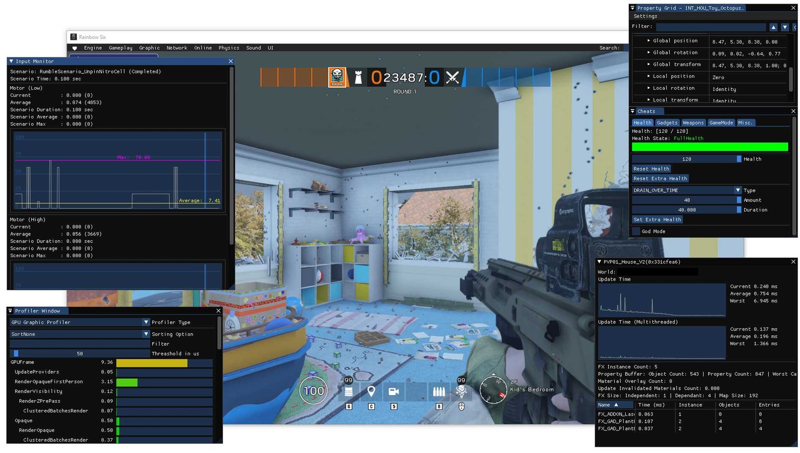
One public example is the rewrite of OGRE to version 2.0, where Matías Goldberg moved the data into large homogeneous arrays and made functions iterate over arrays instead of working with a single element, which by benchmark gave roughly a threefold speedup, and he kept the familiar class abstractions, so the API barely had to be rewritten.
The second mass carrier of the idea is the immediate-mode libraries. The approach itself was invented by Casey Muratori in 2002, and its descendants Dear ImGui and egui today sit inside a huge number of games, but are popular specifically as fast debug interfaces over games, where the UI is small, weakly stylized, and performance isn't critical. Inside, they pile the whole interface into a flat command buffer every frame, that is, it's flat list taken to the limit, there's no tree between frames at all.
// Scene Graph: pretty
struct Widget {
    Transform   transform;
    Widget*     parent;
    Widget*     children[N];   // each child a separate object somewhere on the heap
};

// Flat List: ugly
struct Widgets {
    Transform transform[MAX];  // dense array
    int       parent_id[MAX];  // -1 for root
    // processed in a single linear pass
};
Retained Mode means that the widgets exist permanently, the system holds their state between frames and redraws only what changed. This is how most traditional UI frameworks work, from the browser DOM to the same UGUI, and it's efficient in computation, because if nothing changed, there's nothing to do, but expensive in memory (relatively), because the state has to be stored, synchronized, and updated somewhere.
Immediate Mode is the opposite philosophy, when widgets aren't stored at all as a structure, and every frame the code describes the whole interface anew from scratch. Dear ImGui and Nuklear are built on this, and there's a deceptive simplicity to it.
// Immediate mode: the interface is code
if (gui.Button("Save")) {
    save_game();              // the press is handled right here, in place
}

gui.SliderFloat("Volume", &volume, 0.0f, 1.0f);
gui.Text("FPS: %d", current_fps);
// no tree, no subscriptions, no state between frames
The simplicity is winning because of cheap debugging, since you debug code, and the whole interface can be read top to bottom, and there's no hidden state that could go stale. But you pay for it with having to describe and recompute the whole UI every frame, even if absolutely nothing changed on screen. So immediate mode reigns in debug tools and editors, where it doesn't matter, and far more rarely reaches the final game HUD.
ECS mode is an attempt to stretch a new owl onto the old globe, i.e. the interface onto the same model as the rest of the game world. The idea is in essence also simple, because each widget is an entity that has the components Position, Size, Color, Text, Visible, and the hierarchy is expressed by a Parent { entity_id } component. Bevy UI is probably the most consistent attempt to take the idea to its conclusion, and it sounds wonderful, because in that case one and the same ECS engine spins both gameplay and the interface.
To understand why ECS on UI sounds wonderful but behaves abominably, you have to recall what it appeared for in the first place, and it appeared for a game world with thousands of objects, not for a dozen buttons. The pioneer of the approach is considered to be the engine of Thief: The Dark Project, which was the first to apply ECS, and that same engine was then reused in the sequel and in System Shock 2.

The canonical start of the whole idea was Scott Bilas's talk at GDC 2002 about the game object system in Dungeon Siege, which inspired many later well-known implementations. And the scale there was more than 73 thousand unique object types and about 100 thousand objects placed across the maps, with some levels containing up to 60 thousand entities. ECS was invented for exactly this, for a crowd of identical objects over which systems have to be run linearly and fast.
The temptation, when you already have a fast ECS spinning the whole game world, is to stretch it onto a separate UI engine and express the interface with the same entities and components. One system scheduler, one allocator, one data model for everything, and a widget is in principle no different from a bush or a bullet.
And here the same problem as with flat list crops up. The UI is hierarchical by its nature: the layout is nested, z-order is inherited, events bubble from child to parent. And ECS by its nature loves flat homogeneous crowds of independent entities. When you express a tree through a Parent { entity_id } component, by the very same motion you drag back both the pointer chasing and the need to honor the parent-before-children processing order, that is, all that topological fuss from the previous section, only now on top of the ECS machinery. Plus the ECS itself isn't free on such a profile, and each slightly different widget is a slightly different set of components, and the storage starts to fragment into a multitude of small groups, which eats up the promised linearity.
That's exactly why the community of the same Bevy complains that creating deep hierarchies of interactive UI nodes is hard, and familiar tasks require a heap of boilerplate in the form of marker components, systems, and bundles, which makes the code harder to hold in your head. Now immediate-mode wrappers have started to be bolted on top of ECS-UI, because in immediate mode an ECS-UI can be run, updating the widgets every frame, but that won't be idiomatic or performant anymore. That is, pure ECS turned out to be inconvenient for exactly the part of the UI that immediate mode is good at, and the two approaches had to be reconciled.
In practice, pure ECS-UI doesn't exist in production, and likely won't, because the UI is deeply hierarchical by nature and tied to order (what's drawn over what, who clips whom by bounds, whose press intercepts the event from the lower layer), while ECS in its pure form is ideologically about flat sets of components with no pronounced hierarchy and order. So in real engines the UI usually lives as a separate subsystem with a one-directional data flow, which can stand next to ECS and read data from it, but doesn't try to be pure ECS, because otherwise you quickly run into fighting the framework instead of getting work done.
Axis four: data flow

Storage is about where the widgets lie, and data flow is about how changes reach them.
MVC / MVP is that very classic from the textbooks, where the model holds the data, the view shows it, and the controller or presenter sits in the middle and sorts it out. On the web and in business apps it's still a load-bearing structure, but in games in its pure form it's rare, because the game state changes often, the data comes from many sources, and the neat three-layer ceremony of laying MVC hands on controls quickly turns under such pressure into a mush of controllers.
MVC in its pure form is a rare guest in games. It came from the world of desktop applications of the late seventies and was invented by Trygve Reenskaug at Xerox PARC around 1979 under Smalltalk-80. The task was to separate the data, the form that shows it, and the user's input. Variations grew out of this, and MVP finally took shape in the nineties in the depths of Taligent and IBM as a "controller with broad powers", while MVVM was invented by John Gossman of Microsoft in 2005 specifically for data binding in WPF.
This pattern traces its lineage from business software, where it long ago became a load-bearing structure specifically in web and app development for maintainable UI systems, and nobody designed it for a game workload.
MVC and its kin are built on the assumption that state changes by events and rarely, for example the user entered something in a field, the controller caught it, the model updated, the view redrew. But game state changes not by an event but continuously, every frame, and comes from a heap of sources at once: physics, network, AI, input, animation.
In such an environment this model either starts jerking the notification system a hundred times a frame, or the developer gives up on purity and drags the data around the layers, and this is exactly where that mush of controllers blooms, because the layer that was supposed to sort things out turns into a dump of direct callbacks "fetch this health from that manager right now".
The key detail, without which MVVM in a game makes no sense at all, is the binding layer. But everyone who talks about MVVM in games deliberately skips the fourth part, the one that does all the magic. Because then they wouldn't be able to sell you their super-duper-mega-new framework.
The Binder must already be written by someone as part of the engine or UI framework. It will learn about a change in the ViewModel by an event and update the needed element of the View, and without this binder MVVM is very hard to justify. Such a Binder would have to be written in every single engine, but the framework has already been sold to you, that is, the pattern is viable in games exactly to the extent that the engine gives ready binding mechanisms, and you don't have to write them yourself.
MVVM in gamedev has quite concrete carriers, it's just middleware and engines again. The main one is NoesisGUI, effectively a port of the WPF world into games. There the View is XAML, which designers draw in tools like Blend, the View gets data from the DataContext via data binding, and the authors directly recommend a pure MVVM approach, in which programmers expose information through the DataContext, and that's the Model in MVVM terms.
It works on top of Unity, Unreal, MonoGame, and custom engines, and the clients themselves praise it precisely because the MVVM pattern that Noesis uses is extremely flexible and lets you build large complex interfaces that are easy to maintain, for complex multiplatform titles, from immersive VR interfaces to deep content-creation tools. That "complex multiplatform titles and tools" is the natural habitat of MVVM in games.
The second carrier is Unreal itself, which matured into built-in MVVM and the UMG ViewModel plugin mechanism that appeared in Unreal Engine 5.1, with a field-notify system, where changing a variable through an ordinary Set sends out a notification, and the bindings update automatically.
Curiously, it became built-in fairly late, and Unreal itself long had no out-of-the-box MVVM support, and before that the pattern was brought into UE by several community plugins.
It turns out that MVC/MVP/MVVM is a "business-app" layer imported into games, and it behaves exactly like an imported part, i.e. it slots magnificently into the part of the project that resembles an application, and resists where everything else begins. There is no one correct UI model, just as there is no one correct type of memory, there are only different workloads, for each of which you choose your own, and a living project holds several approaches at once, MVVM in the settings and immediate-mode on the HUD, exactly as a console holds a large slow DRAM next to a fast small SRAM.
So clever game devs dragged in the Reactive / Observable model, which inverts the responsibility, and now the UI subscribes to data changes and updates itself. The HealthComponent changed and fired an event, and all the subscribers (the health bar, the screen redness, the heartbeat sound) learned about it and updated, without asking every frame "well, has it changed yet?". This is very popular in mobile games, because it nicely saves CPU on unnecessary recomputations, but reactivity has a dark side. It loves to grow over with subscriptions and it becomes painfully hard to understand why exactly that widget suddenly redrew and this one didn't, turning debugging into untangling a ball of "who's subscribed to whom".
The idea of all this lies in the Observer pattern from that very Gang of Four book, where the subject-object holds a list of subscribers and pokes them on change. Then the idea matured and was born around animation, that is, around values changing over time, which for our topic is symbolic.
Reactivity came into mass development when Microsoft generalized Observer to data streams in the form of Reactive Extensions for .NET, and today ReactiveX is libraries available in many languages, while the approach itself is focused on data streams and events and inspired by the Observer, Iterator, and functional-programming patterns. That is, reactivity is Observer crossed with the iterator and functional stuff.
Into gamedev, reactivity was dragged primarily through Unity, and the main carrier became UniRx. UniRx (Reactive Extensions for Unity) is a reimplementation of .NET's Reactive Extensions, and its heart is exactly what the interface needs. ReactiveProperty is a special UniRx type that tracks data changes and reacts to them, extending Observable so as to catch a value change in real time and notify subscribers.
There's a moment here that nicely connects with the previous section on MVVM. Remember I said that MVVM in games is alive exactly to the extent that the engine gave you a ready Binder? Well, in Unity there's no such binder, and reactivity plugs this hole, and the authors of UniRx directly write that Unity doesn't provide a UI binding mechanism, and making a binding layer is too complex and costly in performance, so instead of a real binding they use subscription through Observables, and this pattern is called Reactive Presenter.
That is, in the Unity world reactivity is the way to get the effect of MVVM binding without the binder itself, which is especially good for mobile with its battery and weak processor, because event-based updating is cheaper than constant polling.
It's no accident that reactivity took root so firmly precisely in mobile Unity development, from casual stuff to mobile battle royales. On top of that, UniRx also tidies up the rest of the game's event chaos: ObservableTriggers turn Unity events into Observables, and later the async/await integration was split out of it into a separate library, UniTask, and the reactive line continued with new generations of libraries.
And now the very payment. Reactivity inverts the responsibility, and this is great right up until there are few subscriptions. When there become hundreds of them, debugging turns into untangling a ball of "who's subscribed to whom", because the cause-and-effect relationship no longer lies in the code linearly top to bottom, but is smeared across the graph of subscriptions, and to the question "why did this widget redraw and the neighboring one didn't" there's no answer in one place, you have to assemble it across the whole chain of sources.
So smart game devs dragged in the Unidirectional Data Flow model, where the data flows strictly in one direction around a circle. Now the UI is described by state, from it the visible UI is rendered, the visible UI generates events, the events generate new state, the circle closes, and nowhere are there backward arrows.
        ┌──────────────┐
        │    State     │
        └──────┬───────┘
               │ render
               ▼
        ┌──────────────┐
        │      UI      │
        └──────┬───────┘
               │ event (click, input)
               ▼
        ┌──────────────┐
        │    State     │  new state = f(old, event)
        └──────┬───────┘
               └────────► back to State
The idea was inspired by React and Redux from the web, and in games it's found in studios' internal engines precisely because of the predictability of the data flow. Now a large team can work on the interface, including programmers, designers, artists, and animators, and nobody has to hold the entire subscription system in their head at once.
The Flux architecture was presented by Facebook in 2014, and it was born out of the need to deal with tangled two-way bindings and state desync in their rapidly growing single-page applications.
That is, Facebook ran into exactly the ball of "who's subscribed to whom and why did this widget suddenly redraw", and the answer was the hard rule that data flows strictly in one direction. The flow in Flux is unidirectional, which makes it predictable and easy to debug, and importantly, Flux is not a library but an architectural pattern, the cycle "action, dispatcher, store, view".
A year later the idea was brought to a proper implementation, and everything was squeezed down to an extremely simple model with a single store for the whole application, and any changes only through actions that generate the next state, while the previous state remains untouched, and the new one is derived from it. That "the new state is derived from the old, not mutated" is the very picture above without backward arrows.
UDF directly cures the debugging problem from the previous section. With a single source of truth, debugging becomes easier, and you can log state changes, track actions, and even do time-travel debugging, replaying actions and inspecting state at any moment in time. If reactivity smeared the cause-and-effect relationship across the subscription graph, then UDF, on the contrary, logs the sequence of dispatched actions and snapshots of state, and the developer can replay this log of actions to reconstruct and examine any past state, jumping through history forward and back.
To the question "why did this widget redraw" there's now an answer in one place: here's the ordered list of actions, here's the state before and after each change.
Like everything in this series, UDF arrived in games from the web and lives mostly at the level of libraries and philosophy. In Unity and other engines there are Redux-like state libraries, and they're usually applied in the same places as MVVM with its reactivity, i.e. in menu-heavy and mobile projects, shops, inventory, meta-state, that is, in the part of the game that's essentially already a business application.
There's nothing free here, of course. Immutable state means that each change spawns a new version, and all this turns into a stream of memory allocations, which is inadmissible on the hot path. Plus the wedding ceremony, when every tiny change needs an action and a reducer, and for a huge continuously changing game world it's pointless to run every position of every entity through a single store.
Indie developers didn't like any of the above and dragged in the Data Binding model with two-way binding of widgets to data. Now you moved the slider and the value changed, the value changed in code and the slider moved. For forms, settings, and editors this is divinely convenient, right up until you have a field A that affects a field B that affects field A, and the system starts running updates in a circle, because two-way bindings very easily loop, and you get this problem for free along with the convenience.
Two-way binding is not a young indie upstart, but rather a distinguished corporate veteran from which everyone else fled in horror. It's a native of the world of XAML and WPF from Microsoft — already in 2006 it could do mode=TwoWay — and two-way binding was made massively famous (and at the same time infamous) by AngularJS from Google in the early 2010s.
So it would be more correct to say that indies and tool authors didn't invent this approach, but gladly picked up what the enterprise threw away with screams, precisely because for forms, settings, and editors the convenience outweighs all its downsides.
The main charm is that it frees you from having to manually write event listeners and keep the DOM and state in sync. For a settings screen it's just heaven, when you moved the slider, the value changed in code, you changed the value in code, the slider moved, and no glue code has to be written. Under the hood, in Angular this worked through watchers that the framework sets up for each variable bound to $scope, and a digest cycle that walks the scope and its children, updating changes.
In games two-way binding lives in forms, settings, and editors, and almost never on the combat HUD. The most common example is the editors of the engines themselves, like the Unity inspector, the Details panels in Unreal, the Godot inspectors — all these property panels are two-way bound to objects' fields, you change a number in the inspector, it changes in the object, a script changes a field and the inspector updates.
The same in options screens and in level editors and mods built into games. Of the middleware, two-way binding is brought by NoesisGUI with its XAML, where the View gets data from the DataContext via data binding, and the TwoWay mode is available there exactly as in native WPF.
The "indie version" of two-way binding is not even a framework, but the good old hack of passing by pointer. When you write something like SliderFloat("speed", &value), the widget both reads and writes this variable right in place every frame, and this is, in essence, two-way binding, only without watchers, without a digest cycle, and without a hidden subscription graph.
Curiously, precisely because of the absence of this hidden graph, the indie variant runs into looping far more rarely, because everything happens in a deterministic order within a single frame, and you can untangle who overwrote whom just by eye over the code, rather than digging through watchers.
Two-way binding is the apotheosis of convenience, which wipes away all the boilerplate of synchronizing the model and the view, taking a very small fee for it. This is one more answer to the same eternal problem that runs through all the stories: each approach to UI is its own trade-off between convenience, traceability, and performance, exactly as each type of memory in a console is a trade-off between speed, price, and capacity, and it's chosen not "in general" but for a specific data profile.
Signal Graph nobody invited, it came on its own. This is, in essence, a finer version of reactivity, where the interface is described as a directed graph of signals, where each node is a computation depending on its inputs, and when one source changes, the graph automatically recomputes only those nodes that actually depend on the changed input. This is fashionable on the web, and in games it again dwells in internal engines or homemade implementations.
Axis five: element placement

Suppose we've decided where the widgets lie and how data reaches them. Now we have to figure out in which pixels to draw them, and this is a separate large topic, not only for games, called layout.
The Constraint-based approach lets you describe not positions but constraints like "this button is pinned to the right edge", "these two fields are the same width", "the gap between them is no less than eight pixels", after which a "solver" finds concrete coordinates satisfying all the constraints at once. This is how Auto Layout works in iOS, and it's very powerful and expressive, but for the flexibility you pay with the fact that the time to solve the system of constraints is poorly predictable, and unpredictable time is the last thing you want to see in a game's frame budget.
Constraint-based layout is a very old invention, from the very dawn of computer graphics, and its progenitor is Ivan Sutherland's Sketchpad of 1963, the first interactive graphics program, where you could set geometric constraints and the system resolved them.
Then the idea was developed for decades and crystallized in the Cassowary algorithm. Cassowary is an incremental constraint-solving toolkit that efficiently solves systems of linear equalities and inequalities, where the constraints can be either requirements or preferences, and the solver updates the variables so as to satisfy the given constraints.
It was developed by Greg Badros, Alan Borning, and Peter Stuckey, specifically optimized for interface tasks. Then Cassowary took over almost the entire world of app UI and eventually became the layout engine in Mac OS Lion, and from there moved into iOS, that very Auto Layout you've all seen on Apple devices.
Auto Layout earned a reputation as sluggish on large numbers of constraints for good reason, and unpredictable time is a direct path to freezes and stalls. Tellingly, even Apple itself, having built Auto Layout, replaced it in the newer SwiftUI with a simpler and more predictable model where the parent proposes a size and the child chooses its own, precisely for the sake of predictability and speed.
Games almost always bypass the general solver precisely because of the unpredictability, preferring layouts with a bounded, fixed cost: anchors and pivots in Unity uGUI and in Unreal UMG, or flexboxes. Where constraint-based really lives in gamedev is in editors and tools, where there's essentially no frame budget and you can afford a solver, or in mobile games whose menu screens sometimes just use the native Auto Layout or ConstraintLayout.
Flexbox / Flow is simpler and more predictable, now the elements line up along some axis with rules of alignment and wrapping, like cells of a table. Meta's Yoga library implements exactly flexbox, lives in React Native, and from there drove into some game UIs, allowing a good balance between expressiveness and predictability with a clear cost in milliseconds.

Anchors + Offsets still remains the workhorse of game UI, when an element's position is set as an anchor to an edge, center, or corner of the parent plus an offset in pixels. Unity UGUI and Unreal UMG are built around this, and the reason for its popularity is precisely predictability, because anchors are computed trivially, the behavior on a screen-resolution change doesn't change, and the artist understands perfectly what will happen to the element at different resolutions, without running complex checks in their head.
To appreciate why anchors became the workhorse, you have to recall that once they didn't exist for lack of need. In the console era there was exactly one resolution: the Atari, NES, arcade machine drew into a single screen, and element coordinates were just nailed down in pixels, because no other pixels were foreseen.
The problem of positioning was born together with the diversity of screens, when first a zoo of resolutions appeared on PC, and then the mobile boom with its endless aspect ratios made resolution independence mandatory. That's when a way to describe a position so that it survives a screen change was needed, and that way became anchors with offsets.
The position is now not absolute coordinates, but an anchor to an edge, corner, or center of the parent plus an offset in pixels. This is a relative coordinate that's computed trivially and survives a resolution change without any solver, and in essence it's the constraint-based from the previous section, trimmed to the minimal subset of constraints that resolves in O(1) per element, and instead of "find coordinates satisfying the system" here it's "take this edge of the parent and offset by eight pixels", and that's it, no graph of equations.
If the previous models lived in internal engines and tools, then anchors with offsets are the default UI layout in all engines on which a gigantic share of all games is made. So from indies to big titles, any engine offers this by default, and to NOT use anchors you have to make a special effort.
This simplicity also has its payment, and anchors are less expressive than solvers or other systems, and as soon as the layout becomes truly complex and adaptive, the fuss with nested layout groups and fine-tuning begins. So the engines added a flexbox approach on top, and are promoting web patterns with styles as a replacement. That is, anchors don't try to be everything, they cover the cases of simple forms and hand the complex cases off to flexbox.
Anchors + offsets won the layout wars thanks to this simplicity, giving expressiveness on the level of solvers in exchange for a bounded cost, stable behavior, and a model readable by an artist, and for the combat UI this trade-off almost always looks like a victory for anchors, when the workhorse becomes not the smartest tool, but the one whose cost and behavior can be predicted.
Manual / Absolute also remains a workhorse, but it's already moved to the neighboring stable. This is when you just place everything by hand in pixels or normalized coordinates, without any layout engine. This is how Dear ImGui and the overwhelming majority of custom HUD systems live, and it's a normal choice, because for a combat HUD of five elements, building a constraint solver is like shooting sparrows with a cannon.
Retained Immediate Mode (RIMD) is a hybrid that tries to take the best of both worlds, so that the code is written in the pleasant immediate style, while under the hood the system compares what you described with the previous frame and touches only what changed. Conceptually this is what React does with its virtual DOM and what Flutter does, and in this direction, in my opinion, modern game UI is currently drifting, because the developer gets the simplicity of immediate-mode code, and the engine gets the savings of retained redrawing, and both sides are more or less happy.
Axis six: rendering

Next, the programmatically drawn UI has to be turned into pixels, and over the development of games several schools appeared, each of which has fans and detractors.
Canvas-based rendering dumps all widgets into one space, where the order of addition determines what overlaps what, and elements close in state are batched into one pass. Simple, clear, batches excellently, and for most 2D interfaces this is more than enough.
The question of why this is needed comes from the article on console memory. It's not the pixel itself that's expensive, it's the draw call, and each draw call is a GPU state switch and overhead on the CPU side. A naive UI that draws each icon and each letter with a separate call kills the mobile processor long before it runs into fill rate. The Canvas approach is sprite batching applied to the interface, i.e. you have to assemble homogeneous geometry into one mesh and hand it over all at once. So it "batches excellently" not by accident, it was invented for exactly that.
The canvas is responsible for combining its geometry into batches, generating draw commands, and sending them to the graphics system, all in native C++ code, and this is called rebatch or batch build. Computing the batches isn't free, because the meshes are usually taken from components like Canvas Renderer, and to compute the batches you have to sort the meshes by depth and check them for overlaps, shared materials, and so on. That is, "the order of addition determines what overlaps what", and the engine literally sorts by depth and looks for overlaps to understand what can be glued and what can't.
And here the very same cost crops up that we stumbled over in the scene graph section, because the batch is cached and lives until something changes, but because the engine draws the UI in one or a few passes, a canvas element changing position, scale, or rotation forces the canvas to rebuild, and a change of content, for example text, also triggers this rebuild.
And it's not one element that's rebuilt, but everything, because the canvas walks the whole hierarchy to regenerate the list of elements anew, recomputing the vertices, indices, colors, and UVs of all elements. Hence the classic performance collapse on even innocent hover effects on buttons, which trigger a Canvas Rebuild. That is, the canvas's virtue (glued everything into one pass) and its curse (changed one pixel, rebuilt the whole pass) are two sides of the same coin.
This is cured with the technique of splitting into sub-canvases. These are nested canvases that isolate their children from the parent, a "dirty" child doesn't force the parent to rebuild and vice versa. So the canonical advice "move dynamics onto a separate canvas from statics" is a direct consequence of how batching works: let the static background lie in one eternal batch, and let the per-frame ticking timer poke only its own little sub-canvas. The discipline with atlases fits here too, because elements from different textures won't glue into one draw pass no matter how much the engine wants them to.
Canvas-based rendering is how a huge share of games on Unity draw the UI, and conceptually the same thing lies under Unreal's Slate render and under Godot's Control nodes. In 2D and mobile gamedev it's the default, because for most flat interfaces it's more than enough, with a limited number of elements and rare changes, and everything glues together beautifully.
The Layer-based approach splits the interface into layers (world, HUD, menu, tooltips), and each layer is rendered separately with its own depth and blending parameters. This is needed so that different parts of the UI have different composition rules, for example the tooltip is always over everything, the damage effect blends with the world, and the menu must darken the world beneath it, and dragging all this on one flat canvas quickly becomes complex and expensive.

Layer-based rendering was born in film production long before game UI. The final frame in cinema and special effects was traditionally assembled not in one pass but from several, and a scene can be rendered as several layers or passes, which are then composited into a finished frame. This tradition goes all the way back to motion-control shooting of the pre-digital era, when the camera was run past a model ship first for the lit "beauty pass", and then with the same movement the glowing windows and thrusters were shot separately.
Game UI simply inherited this principle, where different parts of the picture live on different layers with their own rules, and are then joined together. The only difference is that in cinema it's offline, and in a game the compositing happens every frame in real time.
The root of the need is precisely that different parts of the UI have different composition rules, and stretching them onto one flat canvas means fighting it. The damage effect must blend with the world by its own blending, the tooltip must be over everything and never dive under other elements, the menu must darken the world beneath it with a translucent backing.
These are three different blend modes and three different depth rules, and trying to express them by order in one flat heap quickly turns into a fight with z-order. Layers cut this knot, giving each class of UI its own space with its own parameters.
The most telling case of application is VR, where layer-based is not a matter of compositing convenience but a direct requirement of the hardware for the sake of the player's readability and comfort. On headsets there are so-called compositor layers, where you can hand a UI widget as a separate layer, turning off its render in the main pass, and then it's drawn by the headset's compositor directly.
This is done because text run through the ordinary render with its reprojection and compression gets blurry and shaky in VR, quickly leading to rippling in the eyes and a headache, while a separate compositor layer stays sharp. On the Meta Quest you can hang up to 16 compositor layers, and everything beyond that simply won't be drawn.
SVG rendering stores all elements, icons, and effects not as ready raster pictures of a fixed size, but as a vector representation, which lets you scale EVERYTHING without artifacts and draw beautiful outlines, shadows, and glow almost for free right in the shader. Today this is used in several frameworks, because artists still prefer textures for their predictability and reliability.
True vector UI in games reached its peak in the Flash era, and the carrier was Scaleform, inside which was a GPU-accelerated renderer with an engine for tessellating vectors into triangles and antialiasing, plus a vector font system and support for all the Flash filters like Glow, Bevel, and DropShadow. There it is, everything from your paragraph: vector, scalability, outlines, and glow almost for free. And half the AAA studios drew menus this way in the 2000s and early 2010s.
But the vector lost in the end, artists prefer textures for their predictability. With an honest vector, the rendering cost depends on the complexity of the shape, a complex glyph or a tricky icon is many curves, much tessellation, an unpredictable load on the frame, that very enemy of the frame budget. Plus the Flash VM on top with its pauses, and when Scaleform was wound down, the pure vector as a way of drawing game UI left the mainstream along with it.
But its simplified relative, on the contrary, captured the industry almost entirely, and you've surely used it without calling it vector. The technique was introduced by Chris Green of Valve: signed distance field rendering was applied in Team Fortress 2 and described for the SIGGRAPH 2007 conference, "Improved Alpha-Tested Magnification for Vector Textures and Special Effects". It lets you draw raster fonts (but that's a special case for glyphs) without jagged edges even at strong magnification. An ordinary bitmap font looks good only on a pixel-perfect hit, while on rotation and scaling it either falls apart into pixels or smears into blur, and SDF fixes this by storing in the texture not color but the distance to the contour, from which the shader restores a sharp boundary at any size.
Then the technique was perfected, because its main ailment was rounded corners, and Viktor Chlumský in his master's thesis came up with multi-channel distance field, which restores sharp corners almost perfectly, using all three color channels, and his msdfgen became the reference implementation. Today it's the standard, and SDF powers TextMeshPro in Unity, while Unreal has a built-in SDF text render for Slate with a choice of field type (multi-channel, single-channel, approximate) and quality right in device profiles. That is, sharp scalable text in almost any modern game is a baked vector, just under the name distance field, not SVG.
SVG rendering is the dream of scalability and cheap effects from the shader, which in games was realized through a compromise. The pure vector offered expressiveness at the price of unpredictable rendering cost, but distance field and textures won, having given up part of the flexibility in exchange for a fixed, budgetable cost. And this is again the same lesson the article on memory began with, predictability of cost is more important than peak beauty, because into the frame budget, as into the console's memory, fits not what's flashier, but what can be computed in advance.
GPU-driven UI moves the formation of the picture toward the graphics card, leaving the processor only the updating of inputs and individual states. This makes sense when there really are very many elements (for example a level editor or a strategy game with thousands of icons), and the bottleneck becomes not the drawing of pixels but the overhead of issuing the draw commands themselves, which we're trying to remove from the CPU.
UI as a shader / fullscreen pass is the most radical end of the spectrum, now the whole UI is drawn by one or several shaders that read data from a texture and themselves decide where and what to draw. Parts of diegetic interfaces and on-screen damage effects can be attributed here too, and it's also a favorite trick of the demoscene, where a traditional UI engine weighs more than the whole demo, and so the interface is drawn almost entirely with math rather than widgets.
The rare, the strange, and the experimental
Beyond this begins territory that mainstream gamedev rarely enters, but it's exactly here that the most interesting ideas dwell, most of this coming from scientific papers or indie tinkering.
Procedural UI is generated from metadata or a schema. The clearest example is no longer games, but engine tools, like the property editor in Unreal or the inspector in Unity, which build the interface themselves from a description of the object's fields, because manually laying out an editor for each component is Sisyphean labor that instantly becomes outdated when a new field is added. In games themselves this sometimes surfaces in roguelikes and procedurally generated content.
Relationship UI abandons hierarchy in favor of a dependency graph, when element A is "bound" to B, "excludes" C, "groups" with D. A tree can't express this, and a graph can, and so this approach is interesting for complex dialogue systems and quest interfaces, where the links between elements are fundamentally non-tree-like (one line opens three branches and closes two others, and you can't draw this as a tree). An example can be found in the recently released game inZoi, which groups interface elements by "relatedness" with neighboring ones.

Simulation UI takes the idea of a diegetic interface to the limit, so that now the interface doesn't convey state but is itself a simulation, its elements have physical properties and can, for example, be damaged. The canonical Dead Space fits here again, because its HUD is part of the suit in the three-dimensional world, which physically reacts to what's happening, or the cracked helmet visor and smeared glass. Here the classification "by placement in the world" and "by architecture" finally meet in one object.
Declarative UI describes the interface declaratively, and part of the work is done ahead of time, at the compile or load stage, for example the positions of static elements are baked into constants so as not to compute them at runtime at all. This is done in console games, where it makes sense to pay with build time so as not to spend a single cycle in the frame computing what's known in advance anyway.
Tangible UI implements the physics of tangible objects, like cards, stacks, shelves, etc., which can be "thrown", and they'll work by the laws of physics. Slay the Spire is partly about this, and the trick here is that physicality in such a UI is no longer a decoration but a way to make the interface intuitive, because our brain knows about the physics of pieces of paper from birth, but not about abstract widgets over a 3D world.
And finally Self-modifying UI, which erases the boundary between data and code and lets you change the UI's code at runtime depending on the player's behavior. In a normal game this sounds like a maintenance nightmare, but in ARG games, where, for example, "hacking" the interface is itself the gameplay, this would be a natural feature, and an interface that the player can rewrite stops being just state and becomes part of the world.
Research and the "what if" territory

And finally, the very far edge of the map, where various research papers and dead startups dwell, and very rarely shipped games, but no less curious for it.
Datalog UI describes the state of the interface as a set of facts in a database, and the visibility and properties of elements as queries to this database. The fact player_health(42) changed, and all the queries that depend on it automatically recomputed, because the engine knows the dependencies of queries on facts. The idea is inspired by Datalog and Datomic and hasn't been implemented in any games I know of, but as a concept "the UI is a query to a fact base" it still excites minds.
Probabilistic UI tries to guess your intentions and, based on predictions, rebuilds the interface in advance, pushing forward the needed buttons and enlarging the clickable zones where you're most likely to reach. This was researched in the context of predictive interfaces for smart glasses, but never made it to production. Partly attributable here is the interface in Crusader Kings, which adapts to your search and pushes to the top recently viewed characters or objects, starts showing hints or events that you marked as important or recently viewed or searched.
Semantic UI describes elements through behavior rather than appearance, letting you define a behavior "this is a confirmation button for a dangerous action", and the system itself chooses how to draw it (red, with an icon, with a confirmation). This is very close to what LLM-driven UI systems are now trying to do, and here we suddenly find ourselves on the cutting edge, because language models are precisely rather good at mapping meaning to a representation.
Cellular Automata UI subjects interface elements to local rules of interaction with the player and neighbors, out of which a global structure grows, and this is already a pure artistic device from the demoscene and art games, where the interface matters not as a convenience but as a spectacle in its own right.
What to do with all this

If you try to fold all these axes into one picture, an unpleasant thing turns out: there is no single correct UI architecture, and anyone who says otherwise simply hasn't gone beyond a couple of axes of their favorite engine. Diegetic or non-diegetic is decided by the designer based on immersion. Scene graph or flat list is decided by the programmer based on the profiler. Reactive or unidirectional is decided by the team lead based on the team's size. Constraint-based or anchors is decided by the platform based on the frame budget, and so on and so forth. And all these decisions, generally speaking, are independent, and this is the answer to the question posed at the very beginning of the first article.
Curiously, the historical arc of the UI is exactly the same as that of console memory. At first everything was computed by hand (manual layout, fixed coordinates, immediate mode), because the hardware was weak and abstractions were an unaffordable luxury. Then rich retained frameworks with trees and auto-layout came, because the hardware got fat and you could pay for convenience. And now the pendulum is going back toward hybrids like RIMD and GPU-driven UI, which again compute exactly as much as needed and not a cycle more, only now not out of poverty but out of maturity.
But the fundamental task over all these decades hasn't changed one iota, and it's the same as that of any other subsystem in a game. The needed data must end up on the screen in the right place, at the right moment, and in the right form, otherwise the player will see a flickering health bar and decide that you have clumsy hands, and will be, in part, right.
← All articles