
About a year ago I gave my son a Steam Deck, and it turned out the console is good not only for Fortnite runs but also for the old classics I never managed to finish when they came out. The first BioShock is one of my favorite games — old enough to show that the principles of good level design have been known for quite a while. And although on my first playthrough back in 2008 it disappointed me a bit — the repetitive NPC behavior and combat, the fuzzy narrative structure and the fragmentary plot — none of that stopped it from staying in my personal top, and the architectural level design definitely played no small part in that.
From the very first reed hut, primitive architects organized a dedicated space for an intended purpose, building ever more complex and elaborate layouts. And of course this couldn't fail to shape level layouts in games too — level designers grew up among these square forms and often have to follow established traditions, both of common human knowledge and of the game industry. Few of them are willing to take a risk and «do it differently», breaking the organization of space within existing constraints and coming up with genuinely interesting «architectural solutions» that could plausibly exist in real life, and therefore don't irritate players. On top of the factors of «applicability» and «realism», level designers also have to account for the experience the player gains as they progress, the game mechanics, and sometimes even things that feel alien to games — the physical properties of materials, limits on visibility of zones, the psychology of people, and even «feng shui». I'll talk about feng shui at the end of the article, and along the way I'll try to show how designers apply various solutions and tricks, using the levels of Ken Levine's game as an example.
What the game is about
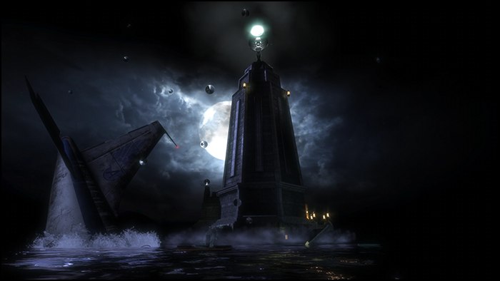
The year is 1960. Somewhere on a plane over the Atlantic is the protagonist, Jack. During the flight the player pulls out a family photo and a box of gifts. He just has time to recall what his parents told him — «Son, you're not like everyone else, you were born for great things» — and at that moment the plane crashes into the ocean. We surface inside a ring of flames and swim toward the only gap. Against the moon we see a lighthouse standing in the middle of the ocean, and we head for it. Inside the lighthouse is a bathysphere that leads down to the underwater city of Rapture. During the descent we get to listen in on a conversation between Johnny and Atlas, arguing about the plane crash near the lighthouse and an encounter with mutants.
Background perception
Buildings and the layout of spaces — from arranging caves to building skyscrapers — enclosed spaces have always been part of our lives. By dividing space into logical zones, we organize and order it according to purpose and our needs. Buildings, rooms, turns and doors help us turn the chaos of open space into a familiar human world; just as coherent, meaningful speech sets humans apart from the animal world, square structures set civilization apart from natural chaos.
Over the course of life people learn, on a subconscious level, to perceive and process a huge amount of data — mostly visual — that is hidden in the environment. Unlike text and speech, such data is processed in the background and is a legacy of our primitive survival skills, which the brain processes much faster than anything else. It is precisely the details that tell what happened and what is happening in the world around the player, warn of danger, or explain the purpose of objects. Small details also give each place in the game its own distinct character.
Engine limitations
Every game level has constraints, both technical and logical. And while the former are more or less clear and the constraints keep getting less noticeable, a designer can run into the logical ones much later, which leads to changes not only in the level geometry but in the game mechanics tied to it. One example of a graceful solution to architectural problems is building maps for UT99, when a level designer might have a little under two hundred polygons for an entire level — this led to all sorts of experiments that produced interesting solutions. Take the Facing Worlds map, where I happened to fight more than a few hundred battles. The designer spent 140 polygons on two towers, 30 were left for the bridge, and nothing was left for the surface. And that added a new pastime — knock your opponent into space. It was especially fun to play 1-on-1 with a friend, when CTF faded into the background and the foreground became the desire to catch the other guy and send him as far and as high as possible.
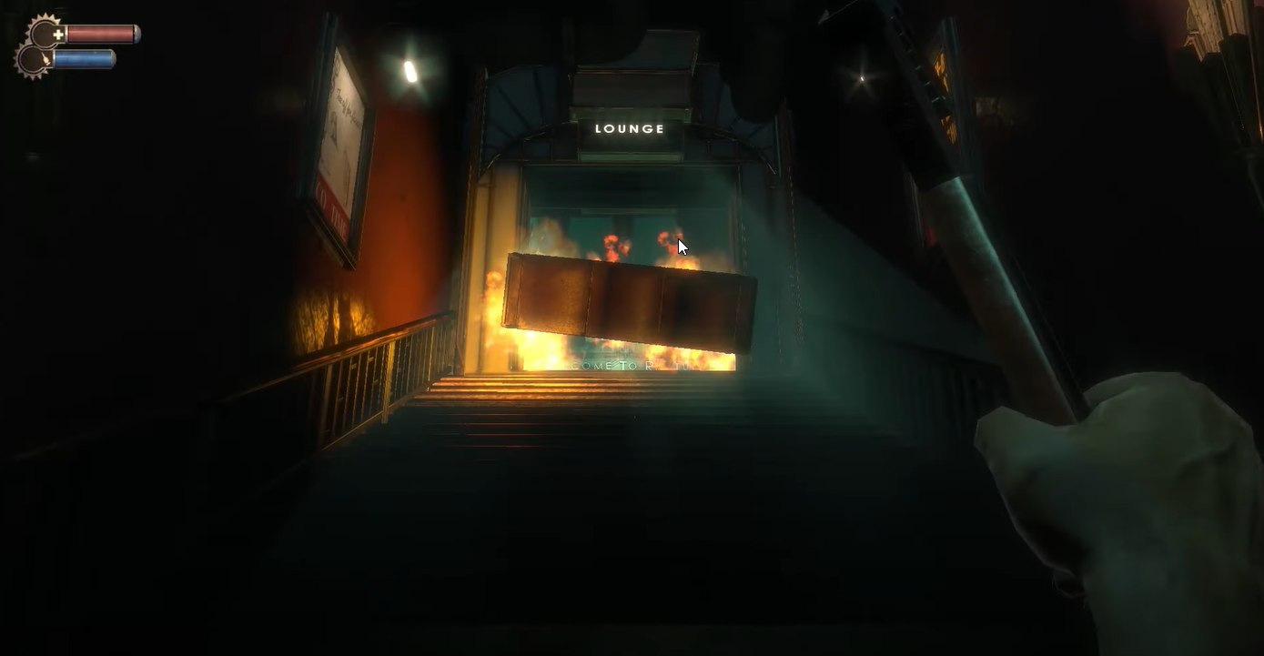
But when a game lays claim to real-world mechanics — like believable movement across surfaces, architectural plausibility of buildings and objects, an approximation of natural physics — then designers have to follow real-world rules too. And those rules are very simple: game elements and mechanics must have truthful, familiar counterparts in real life. This, by the way, is natural knowledge for level designers of the human species, which they train every day in ordinary life. BioShock is built on a heavily modified UE2.5 with several of the studio's cutting-edge technologies, like a group-combat orchestrator and an advanced cover and pathfinding system, which carried over from the previous game, SWAT4. The limits on game geometry were raised significantly, but they were still there — not even the streaming backported from the third version of Unreal saved the day. All the static geometry of a level couldn't hold more than 6k polygons at once, and the developers worked around such moments by placing «peculiar gates», like in the screenshot below, long enough to hide most of the geometry ahead of the player. Triggers stood at the entrance and exit of the gates, switching off and on separate parts of the level respectively, and to keep players from slipping through such gates too quickly, they staged mini cutscenes or unexpected situations there.
Corridors and geometry
To keep the player from learning about plot twists in advance, or to hide new enemies, they are placed into tight rooms and corridors that limit the inflow of visual information. This really is a good way to give a breather between fights; usually corridors and small rooms are both the trigger for unloading the previous location and loading the new one. On top of that, in narrow spaces players pay more attention to the details and the audio side of the game — shooter and horror developers love to exploit this, mixing in various creaks, groans and frightening sounds at these moments to build tension before a new location. Narrow spaces are also best suited for various physics puzzles: the player has nowhere to go and decision time is limited, something the game uses repeatedly, starting in its first minutes. Corridors can also easily be blocked with various objects, which lets them be used as doors and natural level boundaries, while a logical barrier in the form of a fallen cabinet, fire or a broken door isn't perceived by players as artificial.
Labyrinths and shadows
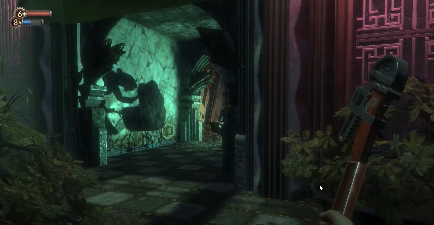
Alongside narrow corridors, the game uses their unnatural intersections at acute angles, which prevents the player from concentrating on the exit point into the next location, while darkness on a level turns spaces that seem familiar and clear to us into confusing labyrinths, playing only on the boundary between light and shadow. Shadows and labyrinths also had an extra function — to hide simplified or missing geometry when the engine ran into level geometry limits. This is especially noticeable in open spaces, where the developers were forced to reduce the amount of small environmental detail in favor of visual dominants. This, however, works well for an atmosphere of mystery.
Frozen story
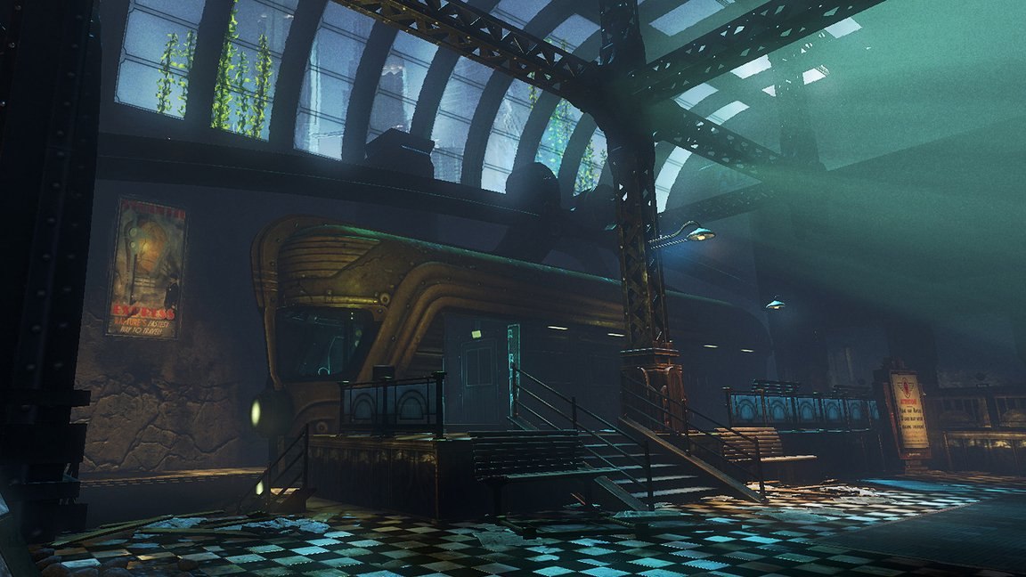
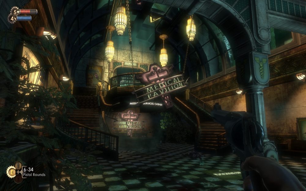
Irrational Games had accumulated experience on their previous projects, so Ken Levine's team invites the player from the very start to dig out the truth themselves, to find information about what happened in this paradise city that turned into a dangerous labyrinth. Semi-open locations, which usually follow corridors, give players the chance to explore the environment relatively freely. At the same time, most semi-open locations have a second component — physics puzzles based on using the game's mechanics. For example, the interaction of electricity and water. The design principles of such locations differ, which lets designers combine the game's mechanics, style and enemies. If in corridors the player simply has nowhere to go, physically confined by walls that direct them forward, then in semi-open locations landmarks and points of interest come to the fore — and these places are very convenient for delivering story through animated scenes and frozen story. Note that most of these little scenes sit among hanging, long or upward-stretched objects, like in the screenshot above, where that role is played by the white lines along the door — they additionally fix the player's attention on a particular spot. This visually stretches the space upward to create a feeling of discomfort, and at the same time sets guiding lines so the player understands where to go next.
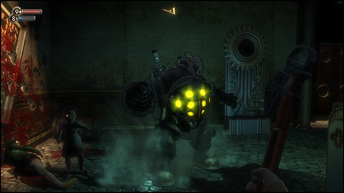
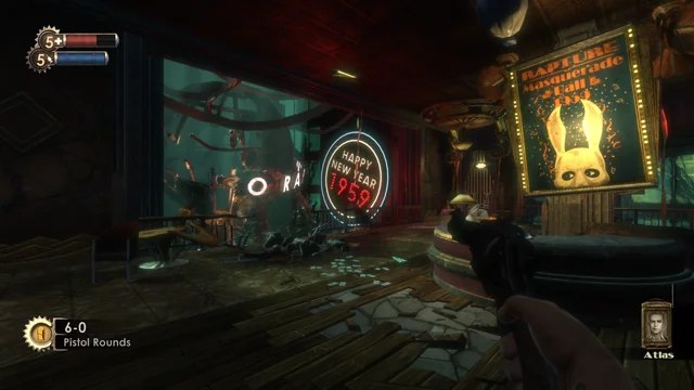
Visual magnets
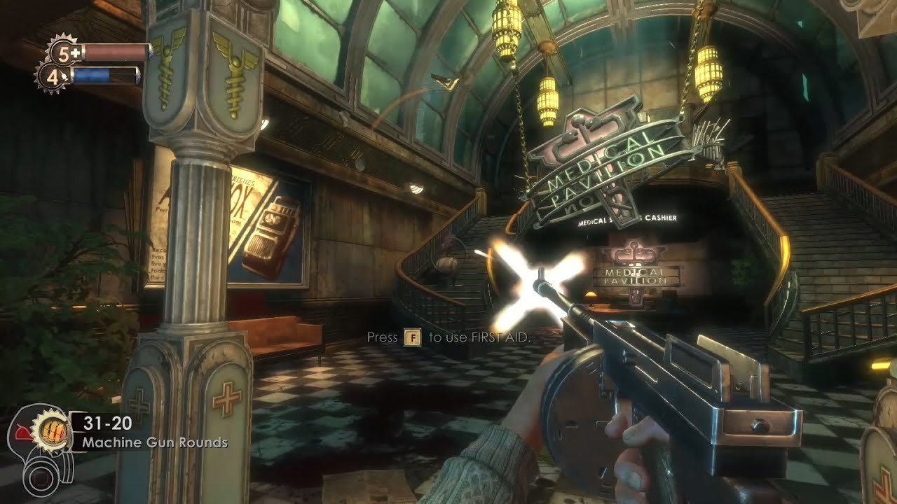
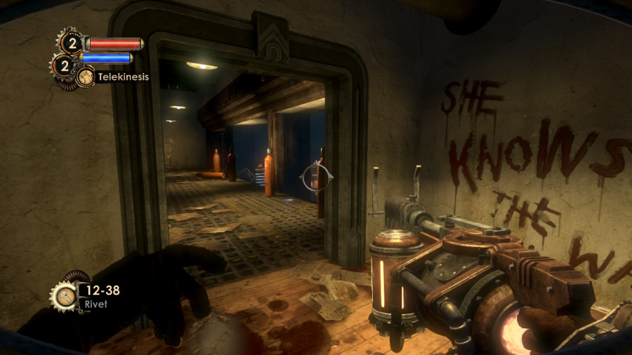
Visual magnets in the game are created mainly through height contrast: if among objects of equal height you place a similar one but roughly twice as tall, a person first pays attention to the taller object and only then to the rest. Such an object becomes a dominant, which, used skillfully, can become an interesting solution for combat, enemy appearances or the application of game mechanics. As in the situation in the screenshot, while the player is busy with the mobs coming down the stairs — the visual dominant — a couple more opponents quietly approach from the side. The developers use this trick more than once, so over time the player develops a reflex of looking around during a fight; this was a novelty for games of that period, when other games tried to concentrate enemies inside the camera frustum.
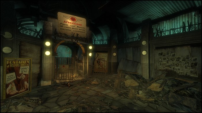
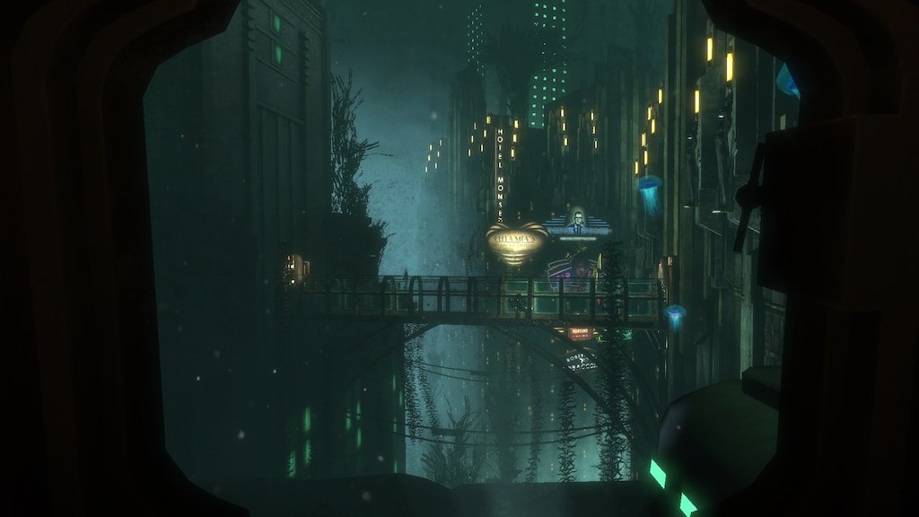
The visual-magnets technique is also applied to buildings outside the gameplay location. They differ in style from the interior spaces designed in the style of the 1960s — the external buildings look more like modern structures and early-1980s buildings with lots of neon and bright light, which gives the impression they were designed much later. According to the developers, they did this to show the player that there's a real world outside the window and to create a contrast with the retro objects around.
Easter eggs
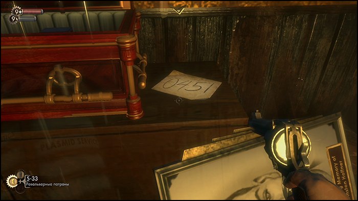
Ken Levine's games were famous for their numerous references to landmark dystopian works and theories of closed human communities, and of course BioShock was no exception. Besides the architecture, which tells the city's story through the environment, the number of additional information sources — in the form of tapes and personal diaries, loudspeaker announcements, posters and ads, and even mystical visions that haunt the player — is simply off the charts. The team managed to convey the story even to the most inattentive speedrunners who just run forward through a level. Such Easter eggs weren't simply scattered around a level; each of them was given its own path to bring the player to a specific point from which the object could be seen. To an attentive explorer BioShock reveals a mass of interesting details about what happened. It's worth noting that in all of Ken's games there were, in some form, hints at these numbers — or at 4891.
Color environment
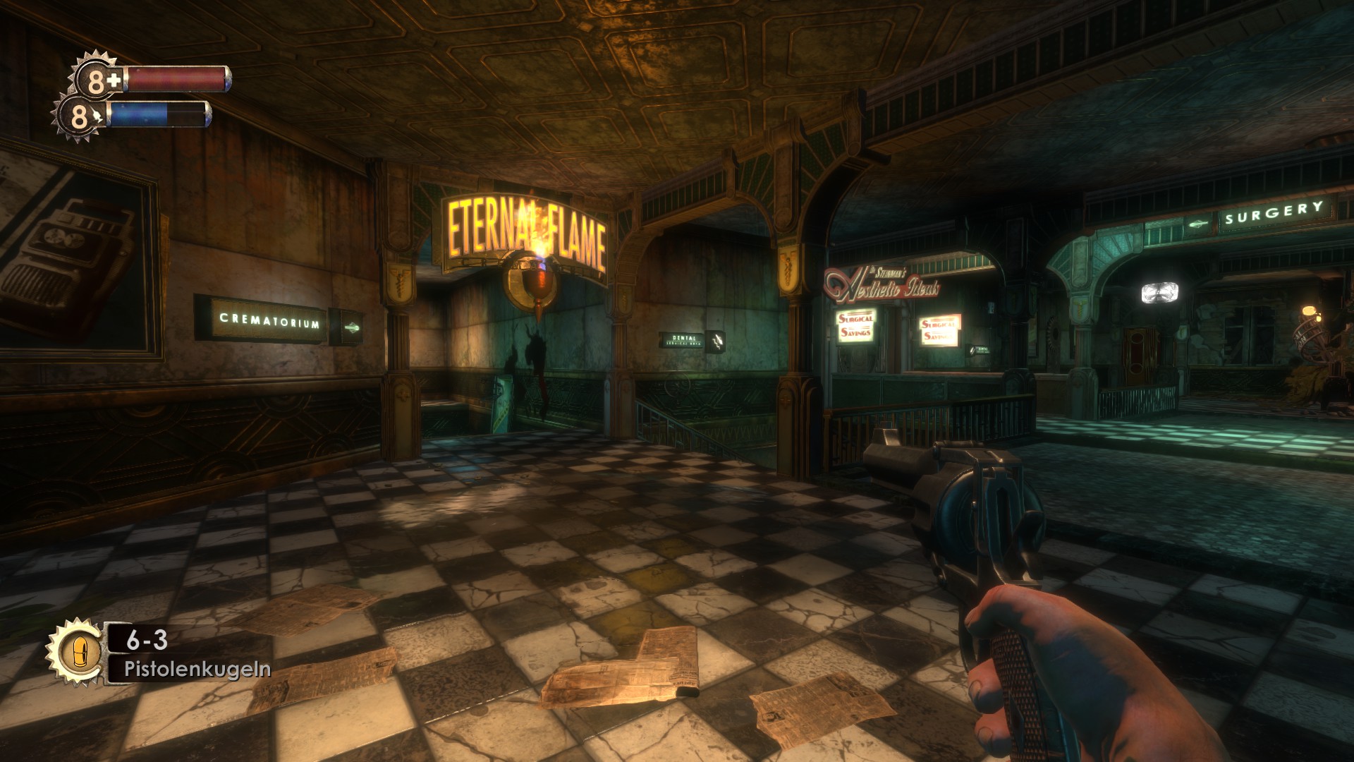
Color is another important means of guiding the player to particular parts of a level. One of the most striking examples in the game is water and shiny surfaces that contrast with their surroundings. The game highlights objects that can be used during play. Another example: all the doors leading forward through the plot are marked with massive arches. Thanks to this non-obvious indication, the player always knows where to go. There are also vertical guides here — a waterfall on the right or flickering lamps on the left, and at the bottom left a door is picked out by directed lighting.
The game develops architecturally in stages, from small rooms to ever larger spaces, and likewise the game's narrative uses the principle of gradually introducing new mechanics, environments and enemies. One of the «correct» principles of game design is demonstrating an enemy's capabilities before the player has to engage it in combat, and here BioShock follows the «show-teach, then fight» rule almost perfectly: each enemy class has its own features that must be taken into account during combat, but the player gets acquainted with them through tutorial cutscenes.
Geometry tuned to enemy traits
Many critics after release noted the well-balanced game AI; this was the work of the level designers, who made a separate movement physics and navigation maps for each enemy type. Brute melee types quickly close the distance to reach the player with a melee weapon, gunners keep their distance and attack in groups, the nitro guys throw Molotov cocktails and grenades, ceiling spiders sneak in closer for a surprise strike. Around the player there are constantly active points that enemies use for aiming, throwing grenades, or checking whether the player can be reached. Most of the level geometry is made on the assumption that enemies can always get to you and strike, but in certain cases — when the path is blocked or couldn't be built to the chosen point — enemies switch into «hide-and-seek mode», fleeing from the player and luring them into open space. This wasn't a core enemy feature in the game, more of an auxiliary AI mechanism, but it keeps fights tense and stops NPCs from getting stuck in objects and acting dumb.
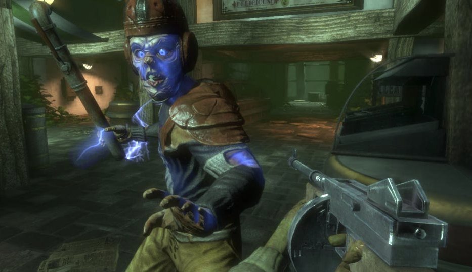
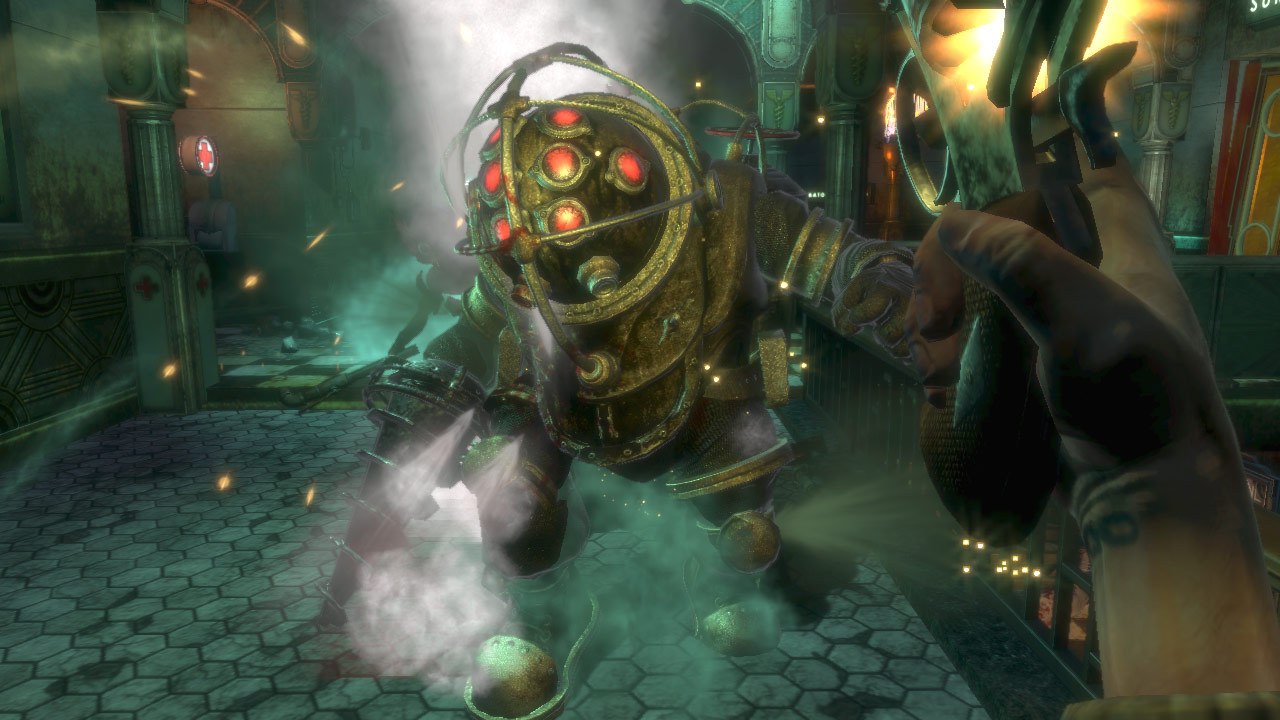
And of course the pinnacle of the game's AI — the Big Daddies, tirelessly escorting the Little Sisters, who because of their size can't use all the available geometry on a level, so separate zones are allocated for fighting them, as free as possible of nooks and narrow passages. In narrow passages you'll see them only in cutscenes and special map sections where they walk along a precomputed path, never turning aside.
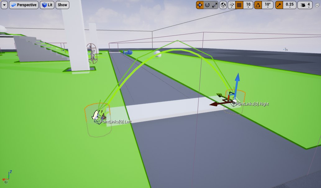
This is called a target path / cover path, usually placed between independent sections of the navigation map. Typically an NPC, while on such a path segment, is invulnerable to weapons, so that a reaction or death doesn't happen outside the navigation map boundaries, because that could lead to getting stuck in objects, the model stretching, and other glitches. You can notice this if you try to corner this NPC and kill it there — because of the specifics of the death animation, which requires free space around the Big Daddy, you won't be able to kill it in a corner.
Storytelling through the environment
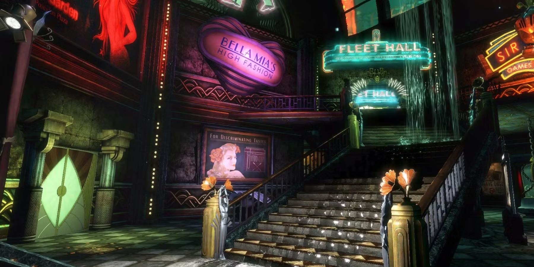
The founders of environmental storytelling are considered to be Harvey Smith and Matthias Worch (GDC 2010), who promote the idea that the narrative design of an environment is one of the properties of space that can be used for deep immersion in the game's atmosphere. Ken's team put this principle at the foundation of their level design, and that became one of the reasons BioShock won the love of players around the world. The game's level design is often called delightful; most critics noted how realistic and atmospheric the underwater city feels and praised the game for its meticulously detailed world. The sharp contrast between outwardly intact buildings and inner ruin adds drama to the story, and all of it is done with static details alone, so that throughout the playthrough the player sees the contrast between the dream city and harsh reality. The environment itself, even without enemies, tells the story of Rapture perfectly — a paradise under the water that turned into a battlefield for a society torn apart by civil war.
At launch there was an annoying bug that disabled enemy AI — they just stood there staring in the player's direction. Later a separate mod appeared that removed the shooting and the enemies, but even in «walking simulator» mode the game turned out no less frightening and let you understand what had happened in the city.
After release
The level of the game's popularity came as a surprise even to the team — the game became a real financial success for the studio, selling around a million copies in the first six months. The team's crunch in the final months before release was generously repaid with «rapturous» player reviews. Who would have thought that a hybrid of RPG, narrative novella and shooter, overloaded with philosophical musings, laid over a biblical plot about the place of God's chosen people in this world and delivered through recordings and tapes, could genuinely interest a broad audience. But this cocktail was to players' taste, and the atmosphere and a relatively living world, immersing you in the details of the story, carried the game to the top of the charts. Nevertheless, many critics noted the manipulation of the protagonist through overly obvious choices between good and evil and the illusory freedom of choice.
On top of this there were other problems — as Levine later admitted in an interview, the game lacked another six months to a year of work, because of which the studio had to cut mechanics and couldn't fully balance the weapons and shooting. Even by 2007 standards it looks a bit too simple and plasticky. But even with the cut mechanics, BioShock delights with a variety of both weapons and abilities; the lack of time told much more on the story and the interaction with the Little Sisters. By the original idea, rescuing them was supposed to lead to the player having no Adam or a severe shortage of it, which would have made fights impassable. The same goes for the game's endings tied to that choice — in the final version only three endings remained instead of the 6 originally planned. Ken intended that a player who ended up in dire conditions would observe the consequences of their choice throughout the whole game, not only in the form of endings. But the «evil» endings ultimately became one of the series' distinctive features and were loved by many, as Levine himself has repeatedly acknowledged.
About feng shui
Many level designers use the rules of this teaching when designing levels to create an atmosphere that fosters harmony and comfort for the player, or conversely to single out particular areas from the overall picture — even though they aren't aware of it.
Object placement: objects placed outside natural forms — like lines, circles, angles close to right angles — that don't pair up with other objects cause discomfort. And most of the objects on the levels are deliberately arranged to cause discomfort. This contrasts especially with the game's advertising and narrative, which show a city of the future while all around there are only broken things.
Use of color and light: a person who lives in sunlight and is used to relying on the boundary of light and shadow and on warm colors again feels discomfort from blurred shadows and unnatural object colors. In the game this shows up through a palette cranked toward yellow on the levels, which makes the lighting of scenes in spaces located underwater feel unnatural.
Harmony of form and proportion: nature made things harmonious, we're used to that, which is why unnatural proportions draw attention — especially when they are set against each other, like a Big Daddy and a Little Sister, or the unnaturally elongated limbs of the mutants. This is reflected not only in the design of the mutants but in the levels themselves and the architecture of the buildings. All the architecture and most of the level objects are stretched upward; this is done deliberately to evoke a feeling of disharmony with the familiar world.
It's not just background
The game is of course more multifaceted, and it found room for «the history of the Jewish people», for criticism of monopoly societies and the theory of self-sufficient states. But this article is more about how level design and architecture, composition and the division of space play a no less important role than the story rails and cutscenes. Properly built spaces guide and constrain the player, encourage exploring corners or hide Easter eggs, and can evoke a feeling of fear or a desire to defend a particular spot. And that's only a small part of how level design plays with the player. The environment isn't just a set of textures or a backdrop for combat — it's a tool that plays on the instincts of a human accustomed to living among buildings, rooms and corridors.
← All articles